Launch day is here — and your catalog is still a mess
You spent weeks developing the collection. You picked the fabrics, perfected the fit, and got the photoshoot done. But when it's time to put together the product grid to post, send to retailers, or publish on your e-commerce store, everything grinds to a halt. Photos scattered across different folders, inconsistent sizing, a look sequence with no visual logic. The result? A launch that fails to convey your brand's value — and sells far less than it should.
The good news: the way you present your catalog directly influences purchasing decisions. And you can fix it before you open the cart. Here are the practical tips to sell more at your next collection launch.
1. Tell a story before you show the price
Fashion buying is emotional. Before pushing SKUs and price tags, show the collection's lookbook: the concept, the world it lives in, the woman (or man) who wears those pieces. A well-sequenced grid — with lifestyle shots, close-up details, and full looks — builds desire before the customer even reaches the product page.
Practical tip: organize your product layout into three sections — collection opener (mood and concept), full looks (how to style the pieces together), and product detail (texture, print, finish). This progression guides the eye and increases engagement time.
2. Commit to visual cohesion in your feed and catalog
A mismatched feed reads as amateurish — even if the pieces themselves are stunning. Before the launch, put together a preview grid with all the images together to check whether the color palette makes sense, whether the backgrounds are consistent, and whether the visual rhythm works. Small adjustments to the order make an enormous difference in how your brand is perceived.
- Use a consistent neutral or on-theme background throughout the entire shoot.
- Alternate between model shots, flatlays, and detail photos to add variety without losing cohesion.
- Avoid placing two very similar colors side by side — spread them out to create rhythm.
3. Prepare assets for each sales channel
A launch that drives revenue uses multiple channels at once: Instagram feed, 9:16 Stories, a PDF catalog for retailers, and images for the e-commerce store. The classic mistake is leaving asset adaptation to the last minute and delivering content that's cropped, pixelated, or out of proportion.
Build the Instagram carousel separately from the PDF catalog. Think of Stories as a fast storefront (maximum 5 pieces per sequence, clear CTA). And in your B2B catalog, include the reference number, available colors, and size chart right below each photo — retailers need that information to place an order.
4. Launch in waves, not all at once
Dropping every piece of the collection at once floods the feed and dilutes desire. A strategy that works: break the launch into waves of 3 to 5 days.
- Teaser (2–3 days before): fabric details, behind-the-scenes from the shoot, countdown.
- Drop 1: the anchor pieces — your best-sellers or most iconic styles.
- Drop 2: complementary pieces, combos, and full looks.
- Closing: last units, testimonials from early buyers, urgency reinforcement.
For each wave, you need a ready-to-go grid or carousel, with images in the right proportions and a defined order. That's where organizing your catalog in advance saves you hours of work during launch week.
5. Don't underestimate the catalog for retailers and wholesale
If you sell wholesale or work with sales reps, a well-put-together catalog is a key sales tool. WhatsApp photos with voice-note captions don't close big orders. A clean PDF with a product grid organized by category, reference numbers, and color options conveys professionalism and makes it easy to hit the minimum order — which is exactly what you want during launch week.
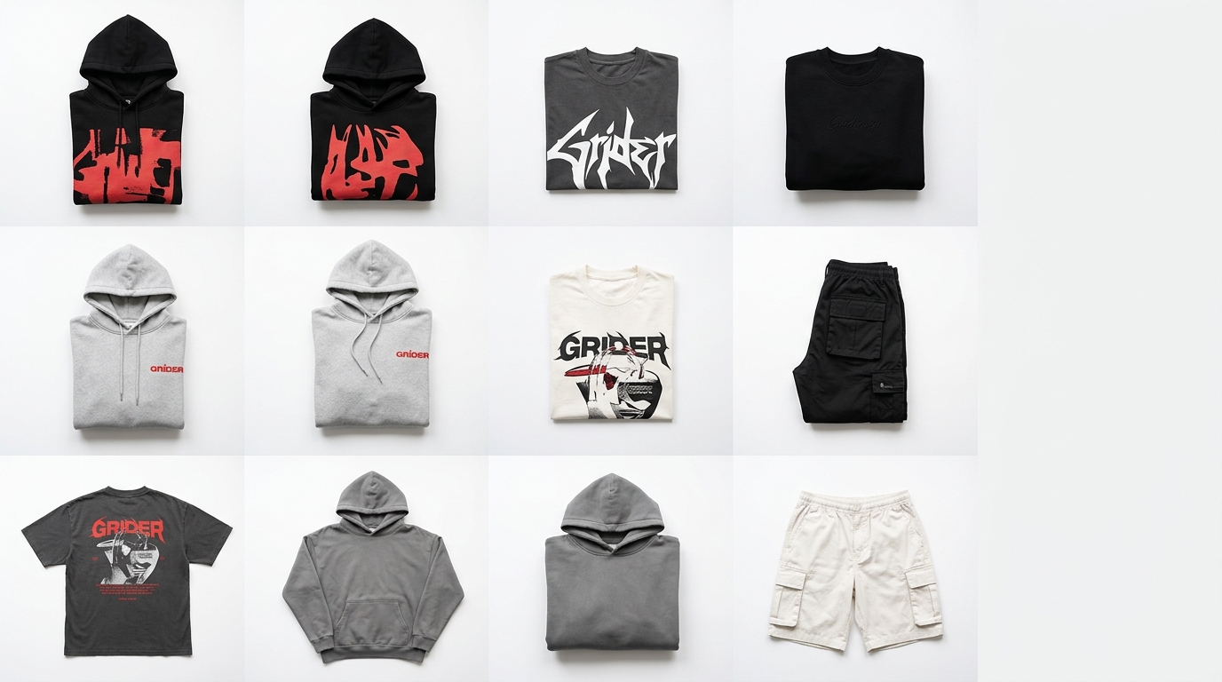
How Grider solves this: from chaos to catalog in minutes
Building a professional product grid used to mean opening Photoshop, creating artboards, importing each photo manually, resizing, aligning, and exporting. Hours of technical work that should have been spent on the product and marketing instead.
With Grider, the process is straightforward:
- Upload your photos: drag your PNGs or JPGs straight into the editor — no complicated file limits.
- Choose your grid layout: select the template that best fits the channel (square for the feed, 9:16 for Stories, portrait for PDF catalog, multi-image carousel).
- Reorder by dragging: rearrange your pieces until the visual sequence makes sense — no exporting, no saving, no starting over.
- Export in high resolution: download the finished file ready to post, print, or send to retailers. No watermark, no account required.
In under 10 minutes you have the launch lookbook ready, the Instagram carousel organized, and the B2B catalog built — all with your brand's visual identity, not the software's.
It works for any brand size: from those launching their very first capsule collection to e-commerce teams that need to build category pages every week.
Recap: what separates a launch that sells from one that goes unnoticed
- Visual storytelling before the price — build desire first.
- Grid cohesion — review the full set before posting anything.
- Channel-specific assets — feed, Stories, catalog, and e-commerce are different contexts.
- Wave-based launch — sustain attention over more days.
- Professional wholesale catalog — close bigger orders with a presentation that matches your product.
Your next launch deserves a presentation that lives up to what you've created. Open the Grider editor now at griderapp.com/editor.html, upload your collection photos, and build your grid in minutes — free, no sign-up, no watermark. The cart opens whenever you're ready; the catalog can be done today.