Have you ever spent time setting up the perfect product layout only to discover the image cropped exactly where it shouldn't? Or posted a beautiful carousel to your feed and it turned square in Stories — looking unprofessional? Choosing the right format isn't a detail: it defines whether your catalog will sell or disappear in the scroll. This guide shows when to use each proportion and how to build your brand's product grid without hassle.
Why does format matter so much for fashion brands?
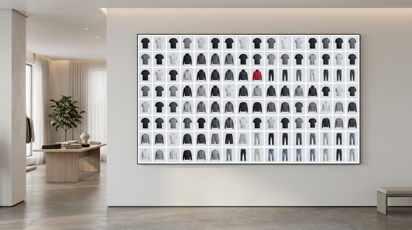
In fashion e-commerce, the image is the product. Customers can't touch the fabric or try on the fit — they decide based on the photo. A well-designed product grid with consistent proportions conveys professionalism and increases the time users spend on your page or profile. A feed with mixed image proportions looks improvised, even if the pieces are amazing.
Instagram offers three main proportions for feed and brand content. Each has the right moment to use — and ignoring this is why many catalogs and lookbooks fall short of their potential.
The three proportions and when to use each one
1:1 — The classic square
The square proportion (1080 × 1080 px) is the safest and most used. It's neutral, takes up predictable space on the feed, and works well for:
- Grids of isolated products (flatlay, neutral background, centered product)
- Quick drops and launches where you need to publish multiple items in sequence and maintain visual cohesion
- Carousels of variations in color or model of the same product
The problem with 1:1: it takes up less screen space than 4:5. If your catalog competes with other brands on the feed, the square can be overshadowed by those using larger proportions.
4:5 — The format that dominates the feed
The portrait proportion (1080 × 1350 px) takes up the most vertical space on Instagram's feed — up to 20% more than the square. This means more attention, more viewing time, and potentially more clicks. Use 4:5 for:
- Model photos (from head to knee height or full body)
- Collection lookbooks — product layout in context, with complete styling
- Catalog carousels where you want to show the piece with details and setting
- Collection launches where visual impact is the priority
Attention: on your profile grid, Instagram always displays in 1:1 — so 4:5 will be cropped in the preview. Plan which parts of the image appear in the square crop.
9:16 — The vertical of Stories and Reels
The 9:16 proportion (1080 × 1920 px) is native to Stories and Reels. It's the full screen of your phone. For clothing brands, it's the ideal format for:
- Catalog Stories with swipe-up or product link
- Launch Reels for drops or capsule collections
- Animated lookbooks or product sequences in video/image
- Paid ads in Stories — where 9:16 is required to avoid black borders
The most common mistake: adapting a product grid made in 1:1 for Stories by simply resizing. The result is a small image with lots of empty space. 9:16 needs to be thought through from scratch — with vertical composition, text, and products positioned for that screen.
Which format to use on Instagram? The quick decision
If you need a practical rule for your brand's daily work:
- Feed focused on isolated product or flatlay? → 1:1
- Feed with model, styling, or lookbook? → 4:5
- Stories, Reels, or Stories ad? → 9:16
And when you need consistency in your profile grid — that cohesive look that gives identity to your brand — mix formats with intention. A sequence of three posts in 4:5 creates a strong visual block. Alternating with 1:1 can break the rhythm if there's no planning.
How Grider solves this for fashion brands
Building your product grid in the right proportion, consistently, is where most teams waste time — whether opening Photoshop for each image or exporting in the wrong size and having to redo it. Grider was made exactly to eliminate that friction.
See how it works in practice:
- Open the editor — no sign-up, no installation, straight in your browser.
- Choose the format — select 1:1, 4:5, or 9:16 depending on the destination (feed, Stories, or lookbook). The canvas adjusts automatically.
- Upload your images — drag JPGs or PNGs of your products directly into the editor. Model photos, flatlays, texture details — everything works.
- Choose a grid layout — Grider offers ready-made layouts for catalogs, lookbooks, and product grids. You drag to reorganize the order of pieces in seconds.
- Export in high resolution — no watermark, in the exact proportion you chose, ready to publish or send to your team.
The result: a cohesive product layout, in the right proportion for each format, without needing a designer or paid software. If you're preparing a drop and need to build a catalog of 20 pieces in 9:16 Stories this afternoon, Grider does it in minutes — not hours.
Common mistakes that ruin your catalog's look
- Mixing proportions on the feed without prior visual planning
- Using 1:1 image in Stories (appears small with borders)
- Exporting in low resolution and publishing pixelated
- Not considering the square crop of your profile when shooting in 4:5
- Building the lookbook in a different proportion than your destination platform
Right format, right results
Image proportion isn't a technical decision — it's a marketing decision. It defines how much space your product occupies on your customer's screen, how your lookbook is perceived, and whether your catalog looks professional or improvised. Choosing between 4:5, 1:1, and 9:16 with intention is one of the simplest adjustments a clothing brand can make to improve visual results immediately.
Don't let the wrong format sabotage a catalog that took days to photograph. Open Grider's editor now, choose the proportion for your next post, upload your products, and export the ready grid in minutes — free, no sign-up, and no watermark.